Diving Into the World of Graphic Design
Hello and welcome! We’re thrilled to escort you through the captivating realm of graphic design. While our guide is chiefly tailored for newcomers, rest assured, there’s a trove of knowledge here that’s poised to propel your journey in the design world.
At a glance, graphic design might strike one as an intricate, perhaps even formidable craft. Indeed, one might conventionally anticipate years of learning to masterfully orchestrate ideas from nascent sketches to their ultimate design realization. However, our endeavor here, spearheaded by Tamaș, is to demystify this perception.
So, What’s Inside?
- The Basics: Grasp foundational concepts spanning color theories, typography, composition, branding, and more. By the guide’s culmination, you’ll proudly wear the badge of a budding graphic designer, ready to carve out your brand, sans the hefty price tags.
- Historical Odyssey: We’ll time-travel, tracing the evolution of graphic design from its fledgling days right through the Industrial Revolution. Delve into styles like Art Nouveau, Modernism, Art Deco, and more. More crucially, understand the bedrock principles that underpin graphic design, encompassing typography, color theory, and composition.
- Tools of the Trade: The latter section navigates the pivotal software and resources in the design arena. Witness the birth of a fictitious brand and the meticulous crafting of its visual identity – think logo designs, visual identity manuals, social media design kits, business cards, and promotional brochures.
- The Icing on the Cake?: We’ll handcraft a sleek, product-centric website using WordPress and Elementor.
Throughout our journey, we lean heavily on two iconic stalwarts from Adobe’s suite: Photoshop and Illustrator. While these form our primary toolkit, we’ll also tip our hat to other noteworthy software and auxiliary resources pivotal for a flourishing graphic design career.
Who Stands to Benefit?
- Budding designers keen on understanding foundational elements.
- Entrepreneurs eyeing to craft a brand before onboarding a professional agency.
- Enthusiasts intrigued by graphic design’s rich tapestry of history.
- Professionals in spheres like social media, product design, or web development, where design prowess is paramount.
Embark on this exciting voyage, and by its end, the realm of graphic design will seem less a dense forest and more a playground of boundless creativity!
Diving into the Art of Graphic Design
Graphic design is a ubiquitous art form that subtly influences our daily lives, whether we realize it or not. At its core, graphic design is the art of crafting and producing images across various mediums—be it paper, stone, ceramics, or most commonly in today’s digital age, computer screens. It encompasses a wide array of creations, from drawings, symbols, and graphic diagrams to personalized logo designs and book covers.
The realization among companies that standing out through professional brand imagery, captivating logos, and unique visual designs could significantly enhance their market presence has led to a substantial increase in demand and appreciation for skilled and efficient graphic designers. Initially, designers were artists sketching forms and concepts based on current trends, such as the modernist graphic design movement. However, as technology became increasingly integrated into the industry and innovative tools started shaping the field, graphic design underwent a significant transformation.
In simple terms, graphic design is the art of amalgamating ideas, images, and text in a manner that informs and engages the audience. It’s a form of visual communication that may involve leveraging the psychology of logo shapes to attract a specific audience or meticulously selecting colors for a website to enhance an organization’s conversion rate.
So, if graphic design is a mode of communication through images, it’s logical to assume that its evolution has paralleled the shifts in human communication. As graphic design companies gain deeper insights into human psychology, consumer behavior, and marketing trends, the art of graphic design adapts and morphs.
The Ever-Evolving Landscape of Graphic Design
In conclusion, graphic design is a continually evolving field with the primary objective of facilitating effective and visually pleasing communication. By merging ideas, images, and text, it informs and engages the audience, fostering a connection between organizations and their target demographic. In the upcoming sections, we will explore the various elements and principles of graphic design, providing you with a comprehensive understanding of this dynamic art form.
Stay tuned as we unravel the intricacies of color theory, typography, composition, and more, guiding you through the practical applications and industry insights that will equip you to navigate the vibrant world of graphic design with confidence and creativity!
The Evolution of Graphic Design: A Journey Through History
In our previous post, we delved into the essence of graphic design and its integration into our modern world. Now, let’s take a step back in time and explore the origins and development of this captivating field throughout the 20th century.
The journey of graphic design, as we know it today, commenced in the early 1900s with the emergence of a plethora of typefaces crafted by graphic designers worldwide. Concurrently, the evolution of advertising and media provided graphic designers with expansive opportunities in newspapers, magazines, and beyond.
The Industrial Revolution and Lithography
The Industrial Revolution ushered in groundbreaking technologies that enhanced efficiency and production across various fields, including graphic design. Lithography, a significant gift from the industrial revolution to graphic design, revolutionized the way images were transferred onto paper, giving birth to chromolithography – color lithography.
The Art Nouveau Movement
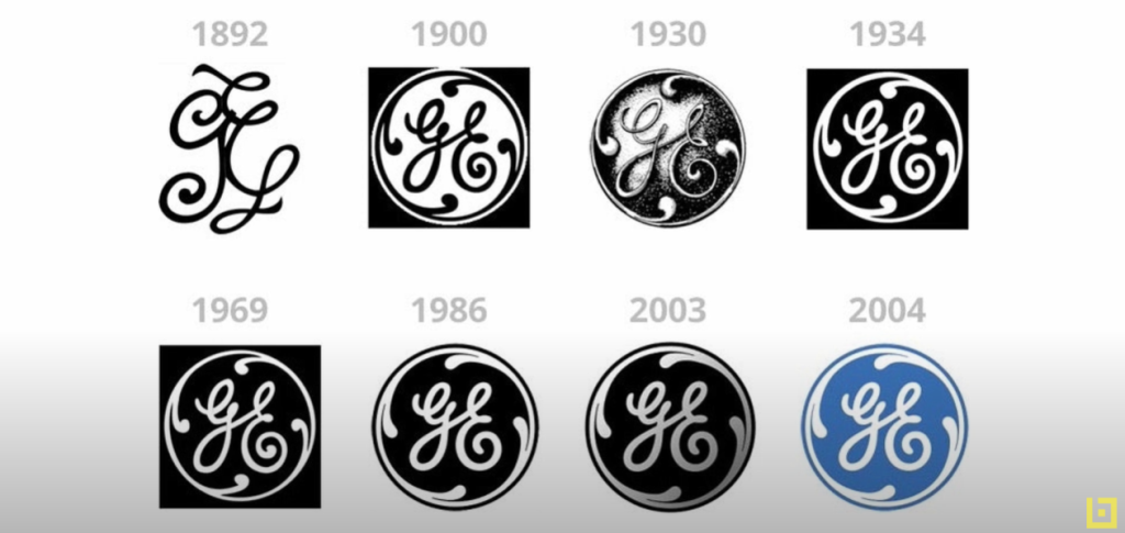
This artistic movement introduced elegant curves and ornamental typography. Although today’s digital era favors simpler designs, Art Nouveau has left a lasting imprint on graphic design, with the General Electric logo being a prime example.
The Bauhaus School and De Stijl Movement
Germany’s Bauhaus School paved the way for modern graphic design, merging simple geometric shapes with minimalist typography. Born during World War I, the De Stijl movement brought an elegant sense of luxury and beauty through the use of straightforward shapes and clear typography.
Modernism and Graphic Design
In the 1950s, modernism emerged, rejecting past artistic styles and emphasizing experimentation with new materials and techniques. The Lufthansa airline logo stands as a testament to modernist design.
The International Typographic Style
Also known as the “Swiss Style,” this movement had a profound influence on 20th-century graphic design and continues to shape the field today. It focuses on typography, particularly sans-serif fonts, as exemplified by the Microsoft logo.
The Digital Era
Today’s graphic design has evolved far beyond traditional lithography and hand-drawn images. Since the launch of the Macintosh computer, more individuals than ever have access to hundreds of tools that make graphic design more efficient and intricate. For instance, the Apple logo has transformed from a modernist design to something simple, elegant, and innovative, mirroring the brand itself.
Conclusion
In conclusion, graphic design is an ever-evolving art form, continually adapting to new technologies, trends, and industry expectations. By understanding these shifts, we can better appreciate the complexity and beauty of this art form that surrounds us in our daily lives. Stay tuned as we continue to explore the multifaceted world of graphic design, offering insights and knowledge to enrich your creative journey!
Graphic Design Today: Navigating the Contemporary Landscape
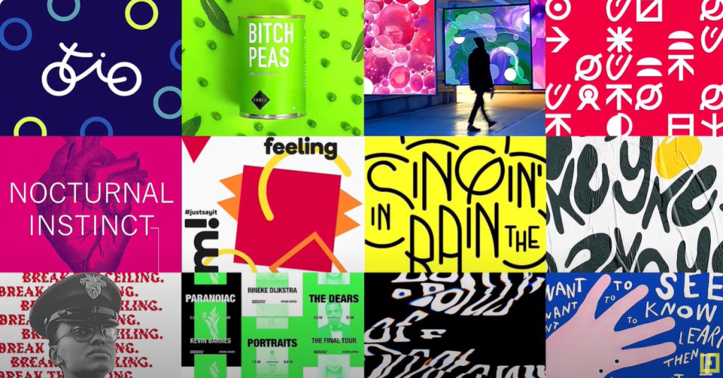
Graphic design continues to evolve in myriad ways, thanks to advancements in technology and increased accessibility to design software. From the lithography of the early 20th century to today’s digital design, the transformations in graphic design have been substantial and ongoing. Let’s explore some of the recent trends and shifts:
1. User Interface and User Experience (UI/UX Design): In a world where digital reigns supreme, user experience has become paramount. Graphic designers must not only craft visually appealing images but also understand how users interact with them. UI/UX design involves creating seamless and intuitive experiences for software or web application users.
2. Augmented and Virtual Reality (AR/VR): With the rapid development of AR and VR technologies, graphic designers are challenged to produce works that fit these new mediums. These technologies allow designers to create immersive experiences, ranging from user interfaces to 3D illustrations.
3. Responsive Design: As mobile device usage surges, graphic design must adapt to a wide array of screen sizes and resolutions. Responsive design entails crafting works that look good and function efficiently regardless of the device.
4. Minimalism: This enduring trend focuses on conveying the message with as few elements as possible. It’s a response to the visual oversaturation many people encounter daily, emphasizing clarity and simplicity.
5. Motion Graphics: The rise in online video content consumption has made animations and motion graphics essential in graphic design. They can make content more engaging and help communicate complex ideas in an accessible manner.
6. Personalization and AI: While designers have always aimed to meet the needs and desires of their target audience, today’s technology allows for individual-level personalization. Artificial intelligence and machine learning algorithms assist designers in crafting works that adapt to the individual needs and preferences of users.
These trends underscore the fact that graphic design continues to evolve and adapt to new technologies and shifts in how people interact with the digital environment. By staying abreast of these developments, designers can ensure their work remains relevant and impactful in this dynamic landscape.
Conclusion:
Graphic design is more than just an art form; it’s a constantly evolving discipline that intertwines with technology, user behavior, and market trends. As we navigate through the digital age, understanding and embracing these trends is essential for anyone looking to make a mark in the world of graphic design. Stay tuned as we delve deeper into each of these trends, providing insights and practical tips to help you harness the power of contemporary design!
How to Kickstart Your Website Design Journey Successfully
Embarking on the journey of designing a website can seem overwhelming for beginners. However, with a few foundational tips, the process can become more straightforward and efficient. This step-by-step guide will help you start on the right foot.
1. Define the Primary Purpose of Your Website: First and foremost, clarify your objectives. A website can serve various functions—it can provide information, sell products or services, collect user data, or fulfill other purposes. Knowing your main goal will allow you to design a site that supports this objective effectively.
2. Ensure User-Friendly Navigation: Whether it’s an e-commerce site or a blog, ease of navigation is crucial. If you’re selling products, the process of browsing, adding to cart, and completing payment should be simple and intuitive. For bloggers, visitors should easily find and read articles.
3. Maintain Simplicity in Design: An overloaded design can be confusing for users. Strive to keep the site simple, avoiding clutter with unnecessary information or graphics. A clean, organized layout enhances user experience and keeps visitors engaged.
4. Optimize for Search Engines: A website needs to be easily discoverable. This means using relevant keywords in titles and content, building quality internal and external links, and ensuring a fast loading time. SEO optimization is vital for increasing your site’s visibility and driving organic traffic.
5. Incorporate Responsive Typography: Typography plays a significant role in web design. Choose fonts that are readable and harmonious with your design theme. Responsive typography ensures that your text looks good on devices of all sizes, enhancing the overall user experience.
6. Leverage Visual Elements: Visuals can make or break your website design. Use high-quality images, videos, and graphics that align with your brand and purpose. Visual elements should complement the content and not distract from the main message.
Conclusion:
Building a successful website involves a clear understanding of its purpose, intuitive navigation, simple design, SEO optimization, and thoughtful use of typography and visuals. By following these guidelines, you’ll be well on your way to creating a website that not only looks good but also serves its intended function effectively. Stay tuned for more insights and practical tips on diving deeper into the world of web design!
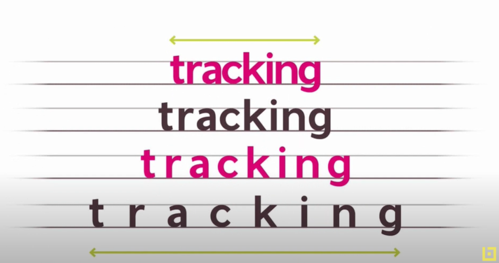
How to Choose and Pair Fonts for Impactful Web Design
The right choice and combination of fonts can be the difference between ordinary and exceptional web design. In this article, we’ll explore how to select and pair fonts to achieve aesthetically pleasing and effective results.
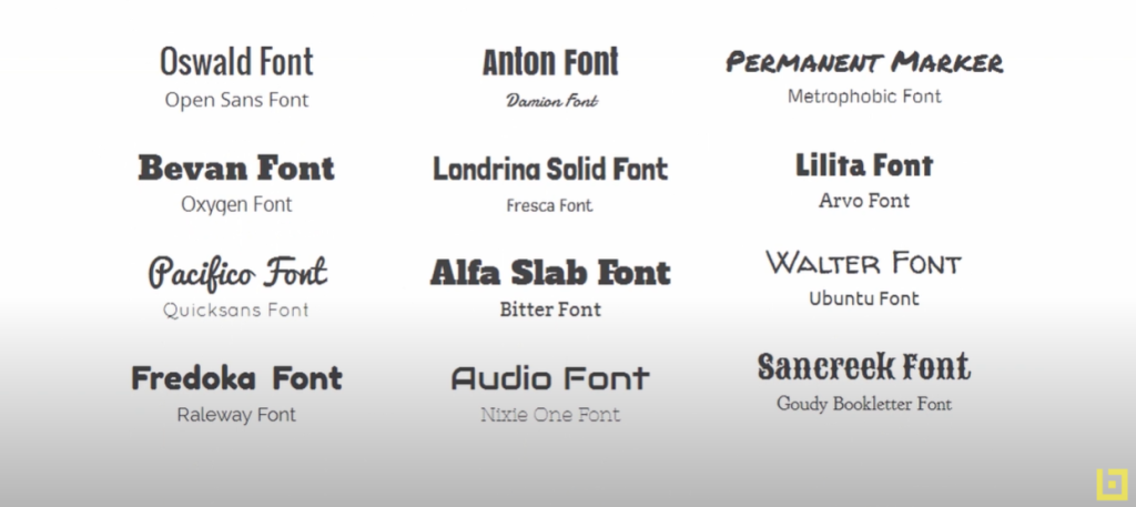
1. Understand Font Personalities: Each font has its personality and conveys specific feelings. Serif fonts are traditional, reliable, and secure, while sans-serif fonts are modern and clean. Script fonts exude romance, grace, and elegance. It’s essential to choose a font that resonates with your brand’s personality.
2. Ideal Font Combinations: A practical approach is using two fonts—one for the body text and one for headings. This combination strongly conveys the message and adds visual diversity.
3. Utilize Super Font Families: If finding the perfect font combination is challenging, turn to super font families. These include both serif and sans-serif fonts, along with a variety of weights, widths, and styles.
4. Aim for Contrast, Not Conflict: An effective font combination should create contrast, not conflict. Choose fonts that complement and contrast each other, guiding the reader’s eye with ease.
5. Avoid Mismatched Combinations: It’s crucial to avoid font pairings that are either too similar or have significantly different styles but similar weights.
Examples of Successful Font Combinations:
- Vizzion, a modern and clean sans-serif font, is ideal for large headings and subheadings. It pairs well with Libre Baskerville, a serif font.
- Anisha, a modern calligraphy font, is perfect for headings in contexts like photography studios or wedding decorations. Pairing it with Lora creates a visually striking experience.
- Roboto Condensed is versatile for both headings and body text. For instance, it can be used in bold for headings and regular for body text, offering a harmonious look.
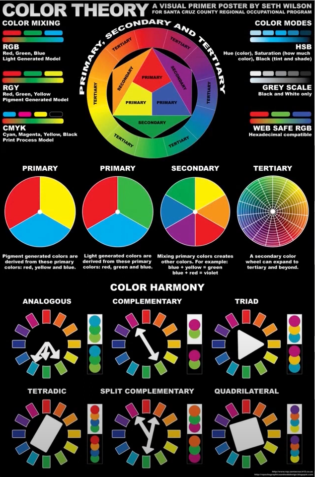
Understanding Color Theory: A Guide to Colorimetry and Color Encoding in Digital Design
Colorimetry and color encoding are essential aspects of color theory, especially in the realm of digital design. They refer to how colors are represented and manipulated in digital contexts. To master the art of digital design, understanding these concepts is crucial. Let’s delve into the fascinating world of color theory!
1. Formation of Colors in Digital Context: In the digital world, colors are formed using two primary color models: RGB (Red, Green, Blue) and CMYK (Cyan, Magenta, Yellow, Black).
2. RGB Color Model: RGB is an additive model, meaning colors are created by adding red, green, and blue light. This model is used in light-emitting devices like computer monitors, TVs, and smartphones. When all three colors are combined at maximum intensity, white light is produced.
RGB color codes are typically represented in hexadecimal format, a base-16 numeric system. For instance, the hexadecimal code for white is #FFFFFF, while black is #000000. In this system, the first two digits represent the red component, the next two the green, and the last two the blue.
3. CMYK Color Model: Conversely, CMYK is a subtractive model, where colors are created by mixing cyan, magenta, yellow, and black pigments. This model is predominantly used in printing. When all four colors are mixed at maximum intensity, black is produced.
4. Beyond RGB and CMYK: Color encoding extends beyond RGB and CMYK. The HSL model (Hue, Saturation, Lightness) is also widely used in digital design, offering designers a more intuitive way to select colors.
5. Variability in Color Perception: It’s essential to remember that color perception can vary due to several factors, including device settings, lighting, and individual color perception. Therefore, designers must carefully check and adjust colors in different contexts to ensure they appear as intended.
Conclusion: Understanding color encoding systems is vital for precisely and efficiently manipulating colors in digital design projects. Armed with this knowledge, you’re well on your way to creating visually stunning and impactful designs that resonate with your audience. Stay tuned for more insights into the vibrant world of color theory and digital design!
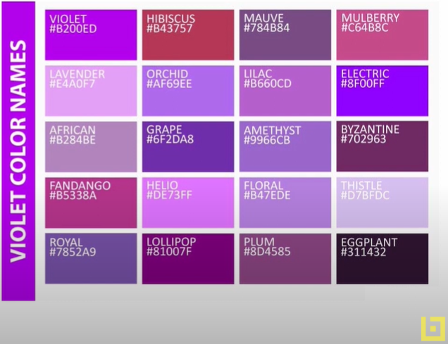
Decoding Color: A Guide to Understanding Color Codes in Design
Every design project, whether it’s crafting a logo, business card, or webpage, necessitates the use of color codes to accurately identify and reproduce chosen shades. In today’s digital era, a plethora of online tools are available to assist you in selecting the right colors for your projects, each utilizing a specific type of color code. Despite the variations in coding, the end goal remains the same: achieving vibrant and precise colors.
In the realm of design, we primarily refer to three types of color codes: CMYK, RGB, and HEX. Grasping these color models is pivotal for attaining the desired outcomes.
1. CMYK (Cyan, Magenta, Yellow, Black): CMYK is a subtractive color model, widely used in printing. In this model, colors are expressed through a value ranging from 0 to 100 for each component. When all four components reach 100, the result is black; conversely, when all values are zero, the outcome is white. By manipulating these values, a vast spectrum of shades can be achieved.
2. RGB (Red, Green, Blue): On the other hand, the RGB model is employed in light-emitting devices such as computer and laptop monitors. This model is additive, meaning the more color you add, the closer the result gets to white. RGB operates on a scale from 0 to 255 for each component. Therefore, RGB (0,0,0) is black, while RGB (255,255,255) is white.
3. HEX Code: Lastly, we have the HEX code, a hexadecimal color encoding system frequently used in web design. A HEX code consists of six hexadecimal digits (0-9 and A-F), preceded by a hash symbol (#). These six digits represent the intensity of the red, green, and blue components, in that order.
Conclusion: Understanding how these color models function and how they apply in various contexts is essential for any designer. With the aid of these color codes and design software like Adobe Photoshop or Illustrator, you can create and reproduce colors with pinpoint accuracy, ensuring the success of any design project you undertake. Stay colorful and keep designing!
How to Choose Colors for Your Design Project
Choosing the right colors is a pivotal step in crafting a design project, whether it’s for a brand, product, or any visual presentation. In this article, we’ll delve into the significance of colors and explore how they can shape the audience’s perception of a brand or product.
Understanding Color Preferences
Color preferences often stem from childhood, influenced by positive associations we might have with a favorite shirt or animal. Additionally, the industry we operate in can dictate our color choices. For instance, blue, symbolizing reliability and stability, is a go-to color for high-tech companies, insurance firms, and healthcare providers. On the other hand, red, known to stimulate appetite, is a popular choice in the food industry.
Keeping Up with Color Trends
Color trends are shaped by various social, political, sports, musical, and technological contexts. For example, the 1950s were characterized by pastel shades, while the tumultuous 1960s saw a preference for bolder colors. Nowadays, international influences promote richer color palettes, allowing designers to experiment with a diverse spectrum of hues.
Recognizing Emotional Reactions to Colors
Emotional reactions to colors are partly formed by cultural and personal experiences, and responses can vary based on gender, age, and culture. For example, red is often perceived as exciting and dangerous, pink as youthful and energetic, and orange as friendly and pleasant.
Aligning Colors with Company Values
When creating a logo, it’s crucial to understand the core values of the company, as the colors you choose can either enhance or dilute the message you’re trying to convey. For instance, red could be an excellent choice for a restaurant coupon, while green, symbolizing birth and renewal, might not be suitable for a brochure promoting funeral services.
Considering Cultural, Political, and Religious Connotations
It’s also vital to consider the cultural, political, and religious connotations of certain colors. For example, green is a sacred color in Islam, so it might not be the best choice for a restaurant campaign.
Conclusion
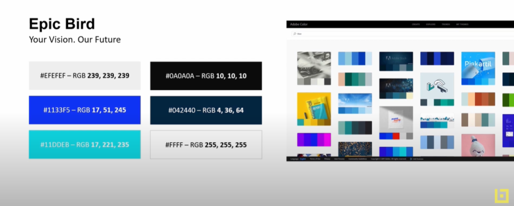
In conclusion, selecting colors for a design project goes beyond personal taste; it requires a deep understanding of how colors can influence public perception. If you need inspiration in choosing colors, online resources like Adobe Color can offer thousands of color palettes created by other designers, providing a valuable starting point for your project.
Remember, the right color choices can make your design stand out, resonate with the target audience, and ultimately, ensure the success of your brand or product.
How to Utilize Graphic Design Software
Graphic design software is a quintessential tool for any graphic designer aiming to create compelling visuals. In this article, we’ll explore some of the most widely used programs and how they can be leveraged for successful graphic design projects.
Adobe Suite: InDesign, Photoshop, and Illustrator
Adobe InDesign, Photoshop, and Illustrator are among the most popular graphic design programs. InDesign is commonly used for creating and editing visual materials, making it a go-to for layout designs such as brochures, magazines, and posters. Photoshop specializes in photo manipulation and graphic creation, allowing designers to enhance images and craft detailed compositions. Illustrator, on the other hand, is renowned for creating vector images, enabling designers to craft scalable and versatile graphics.
CorelDRAW: A Vector Graphic Editor
CorelDRAW is another significant player in the graphic design realm, primarily used for editing vector graphics. It offers a range of features that allow designers to create logos, illustrations, and other graphic elements with precision and flexibility.
Pricing Options and Licenses
These software programs come with a variety of pricing options, including monthly, annual, and lifetime licenses. Adobe Creative Cloud, which encompasses Photoshop, Illustrator, and several other programs, is priced at approximately $21 per month for a single app or $53 per month for the complete package. CorelDRAW provides annual or lifetime license options, costing around €240 per year or €700 for a lifetime license.
Conclusion
In conclusion, to thrive as a graphic designer, one must possess a profound understanding of colors and be adept at using graphic design software. These programs are instrumental in translating creative ideas into visually appealing designs, and mastering them is essential for anyone aspiring to excel in the field of graphic design. Whether you’re enhancing images with Photoshop, crafting layouts with InDesign, or creating vector graphics with Illustrator or CorelDRAW, these tools are your gateway to producing professional and impactful designs.
What is Branding?
Branding is a fundamental concept in marketing and design, playing a pivotal role in how a product or service is perceived by the public. In essence, while a product is anything that can be offered in a market to satisfy a want or need, a brand is the “how” you sell it. It’s the idea or image that people have in mind when thinking about a company’s products, services, and activities.
The Essence of a Product
A product can range from physical goods, services, experiences, to information and ideas. For instance, water, a vital and freely available resource, became a product when individuals and companies started commercializing it, selling bottled mineral water.
The Unique Identity of a Brand
A brand, on the other hand, is a unique identifier. It encompasses a name, term, design, symbol, or any other feature that distinguishes a seller’s goods or services from those of others. It’s not just created by the physical characteristics of a product but also by the feelings that consumers develop towards the company or its product. This amalgamation of physical and emotional aspects is triggered when a consumer is exposed to the brand name, logos, visual identity, or even communication messages.
The Emotional Connection
Brands build an emotional connection with consumers. For example, the taste of Pepsi and Coca Cola are quite similar, yet some people feel more drawn to Coca Cola. This is due to the way each company has built its brand. The emotional connection that a brand creates can greatly influence purchasing decisions and foster customer loyalty.
Branding in Action: The Water Industry
Take the water industry as an example. Companies selling water have developed distinct brands to persuade people to buy their water. Evian, Perrier, Fiji, and Voss are some of these brands, each conveying a different significance to the water they sell. Evian promotes youthfulness, Perrier signifies freshness, Fiji is associated with purity and natural health. Thus, a brand is often the first impression a person has about a product or a company.
Conclusion
In conclusion, branding is not just about having a recognizable name or logo. It’s about building a reputation, creating an emotional connection, and conveying values. It’s what makes a product or company unique and influences consumer behavior. Understanding the power of branding is essential for anyone looking to make a mark in the competitive market landscape.

How to Define a Brand
A strong brand is more than just a name or a logo—it represents a company’s identity and values. Crafting a memorable and successful brand involves several essential steps. Here’s a guide on how to define your brand effectively:
1. Define Your Brand
Start by clarifying what your brand is and what it isn’t. Construct a brand positioning statement that clearly conveys your brand’s mission, values, and unique differentiators. This foundational step helps in aligning all subsequent branding efforts.
2. Create Brand Identity
Brand identity encompasses the name, tone, design, and visual identity. These elements should reflect the brand’s values and mission. Consistency in brand identity fosters recognition and trust among consumers.
3. Communicate Effectively
Consider how you will communicate with your target audience. Utilize various communication channels, from TV and radio advertisements to online ads, websites, and mobile apps. Tailor your message to resonate with your audience through each medium.
4. Enhance Customer Experience
Ensure that your brand is present and cohesive across all customer touchpoints, whether it’s in-store interaction, online experience, or customer service. A consistent and positive customer experience strengthens brand loyalty.
5. Focus on Product Design and Packaging
Don’t overlook the importance of product design and packaging. These can be key differentiators, helping attract consumer attention and setting you apart from competitors. Packaging design should be visually appealing and reflective of the brand identity.
6. Pricing Strategy
Align your pricing strategy with the brand’s market positioning. The price set for your products or services communicates the brand’s values and quality. Ensure that pricing reflects the perceived value and is competitive within the market.
7. Maintain Consistency
Whether undergoing rebranding or launching a new brand, maintain consistency and alignment with your brand values. From corporate identity to presentation materials and website design, every element should reflect the essence of your brand.
8. Be Patient and Persistent
Building a strong brand doesn’t happen overnight. It’s a process that requires time, dedication, and consistency. With a well-thought-out strategy and implementation, your brand can achieve recognition and success.
Conclusion
Defining a brand is a multifaceted process that involves strategic planning and execution. By following these steps and staying true to your brand’s values and mission, you can establish a brand that resonates with consumers and stands the test of time.
The Importance of Branding for Business Success
Branding is a pivotal element for any business due to its significant impact on how a company is perceived by the public. A well-constructed brand can drive new business, elevate brand awareness, and provide a substantial competitive edge.
Brand Recognition
The primary reason branding is essential for a company is that it facilitates recognition and enhances its reputation. The logo, being the most crucial element of a brand, needs to be strong and easily memorable, making a lasting impression at first glance.
Generating Future Business
A robust brand can increase a business’s value, offering it a competitive advantage in the market. Not only does this make the company more appealing to investors, but it also facilitates referrals, a powerful engine for business development.
Employee Satisfaction and Pride
Employees working for a company with a strong brand are more satisfied with their jobs as they feel proud to be associated with a recognized and appreciated brand. This sense of pride and belonging can lead to increased productivity and loyalty.
Consumer Trust
A professional appearance and well-executed branding strategy significantly contribute to consumer trust. Customers are far more likely to engage with a company that appears professional and exudes confidence, thereby fostering customer loyalty and repeat business.
Consistent Advertising Strategies
Advertising is a key component of branding. Corresponding advertising strategies directly reflect the brand and the image a company wishes to convey. Consistency in advertising helps in building a cohesive brand image and reinforces the brand message.
Conclusion
Branding is a complex process that requires time and dedication, but with a well-thought-out and implemented strategy, it can yield impressive results for any business. In conclusion, a strong brand not only enhances recognition and the image of a company but also establishes trust among consumers and employees alike, ultimately contributing to the long-term success of the business. By investing in branding, businesses can position themselves effectively in the market and build lasting relationships with their audience.

Introducing Photoshop
Photoshop, a fundamental tool in the field of graphic design, might seem intricate for those approaching it for the first time. However, understanding some basic principles can help you quickly and efficiently grasp its functionalities.
Understanding the Structure
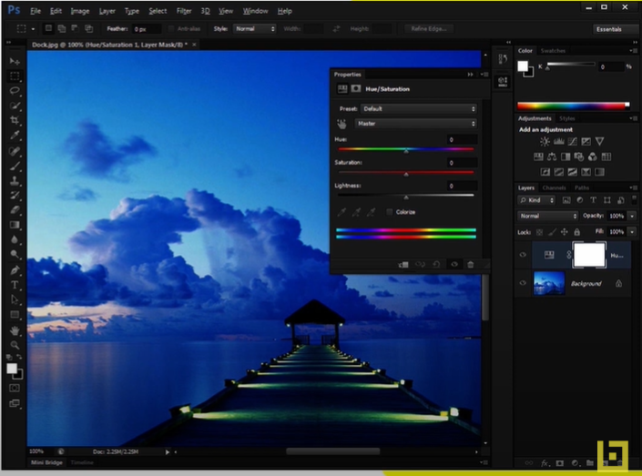
Firstly, it’s essential to understand Photoshop’s structure. It is divided into three main areas: the menu bar, the tool panels, and the workspace.
- Menu Bar: Located at the top of the screen, the menu bar contains all the functions of the program, grouped into categories such as “File,” “Edit,” “Image,” “Layer,” and many more.
- Tool Panels: Typically situated on the right side of the screen, the tool panels contain specific tools for image editing, such as canvas, rectangle, ellipse, brush, pencil, and others.
- Workspace: This is the center of attention, where you have the opportunity to view and edit the current image.
Mastering the Tools
Learning to use Photoshop’s tools efficiently is another essential step. Experimenting with the various tools and features will help you discover what each can do and how they can enhance your workflow.
Familiarizing with Layers
Lastly, becoming familiar with layers is crucial. Layers allow you to work on different parts of an image without affecting the rest of it. Think of them as a stack of transparent papers that you can edit independently of one another.
Practice is Key
Remember, the key to becoming proficient in Photoshop is practice. The more time you spend exploring and experimenting with the program, the more skilled you will become in manipulating and creating high-quality images.
This is just the tip of the iceberg when it comes to what Photoshop has to offer. With consistent study and a desire to learn, you can unlock a new level of creativity in graphic design.
Encouragement for New Users
We encourage all new users to explore and play with the tools, without the fear of making mistakes. In Photoshop, any mistake can be easily undone, so there’s no reason not to experiment. Dive in, explore the myriad of possibilities, and let your creativity flourish!

Introducing Adobe Illustrator
Adobe Illustrator stands as a recognized standard in the graphic design industry, utilized by millions of designers and artists to create a wide array of vector graphics. Thanks to its vector-based nature, artworks crafted in Illustrator can be resized to any dimension without losing clarity or quality.
Key Features and Functions
Among its features are the abilities to create logos, icons, book illustrations, product packaging, and billboards. The program offers a variety of tools for drawing, resizing, cutting, moving, or zooming, each easily accessible from the sidebar.
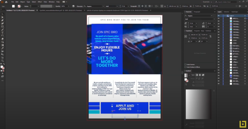
With Adobe Illustrator, you can craft iconic artworks, using drawing tools to transform simple shapes and colors into sophisticated graphics. Additionally, you can create stunning typography, whether incorporating a company’s name into a logo, crafting a brochure, or prototyping a website design. Illustrator allows you to add effects, stylize, and edit individual characters to create typographic designs that perfectly convey the intended messages.
User Interface and Comparison with Photoshop
When working with Illustrator, you’ll find that the program’s interface is quite similar to Adobe Photoshop, with many common tools and settings. However, while Photoshop is more suited for photo editing, Illustrator is designed for creating and manipulating vector graphics.
Versatility and High-Quality Artwork
In summary, Adobe Illustrator is a powerful and versatile tool for graphic design and illustrations, offering a plethora of features to help you create impressive and high-quality artworks. Whether you are a seasoned designer or a beginner exploring the realms of graphic design, Illustrator provides a comprehensive platform to bring your creative visions to life.

How to Create a New Brand
In today’s digital era, establishing a brand is pivotal for any business, whether it’s an IT firm or any other type of company. In this article, we will walk you through the step-by-step process of building a brand for a fictional company named “Epic Board.”
1. Defining the Brand
Epic Board is an IT company offering a wide array of information technology services. Operating from an impressive headquarters housing over 500 employees and featuring a restaurant, we will design branding elements for both the IT company and its restaurant.
2. Designing a Logo
The first step in brand creation is logo design. For Epic Board, we envisioned a simple logo with shades of blue—a color often associated with the tech sector. Alongside the logo, we will create all the essential branding elements, such as minimalist designs for business cards, letterheads, and brochures.
3. Creating a Brand Identity Manual
A crucial component in the branding process is the brand identity manual. This guide will include specifications for fonts, colors, images, and rules regarding the use of the Epic Board logo. This manual is especially helpful for business partners and potential sponsors, providing a clear picture of how the logo and branding elements should be used.
4. Social Media Branding
A brand must also have a presence online. We will design avatars, cover photos, and posts for popular social media platforms like Facebook, Instagram, Twitter, and LinkedIn.
5. Selecting Colors and Typography
For Epic Board, we chose shades of blue and grey. These colors were selected using Adobe Color. Additionally, we opted for two sans-serif fonts—Poppins and Roboto, which can be downloaded for free from websites like Font Squirrel.
6. Choosing Images for the Website
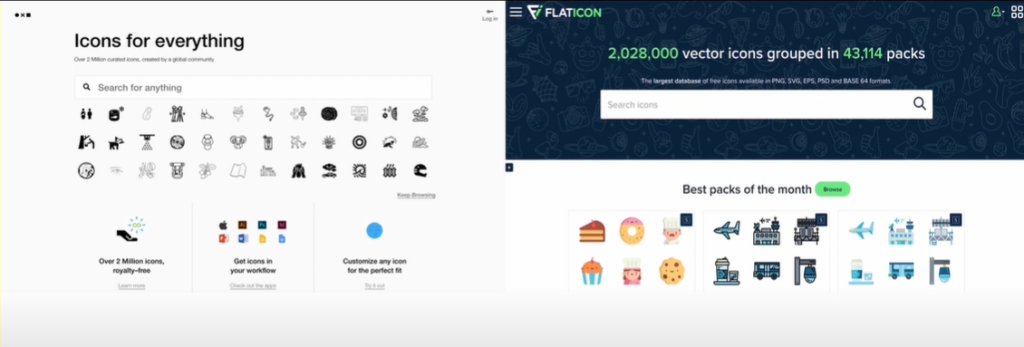
We also selected images to be used on the presentation website. These were downloaded from Unsplash, using keywords related to technology.
In conclusion, creating a brand for an IT company involves several steps—from defining the brand, designing a logo, developing a brand identity manual, to selecting the appropriate colors and fonts. With patience and attention to detail, anyone can build a robust brand for their business.
Logo creation in Adobe Illustrator
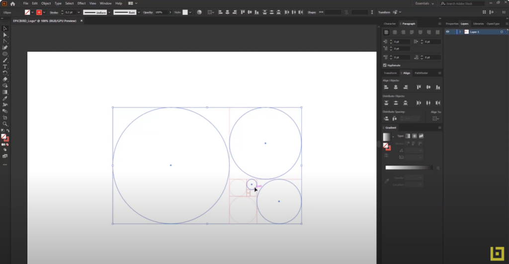
Step 1: Start a New Project
Launch Adobe Illustrator and create a new document. Choose the appropriate dimensions for your logo, but don’t worry if you’re unsure, as you can adjust the size later.
Step 2: Sketch Your Idea
Begin by sketching your logo idea using the ‘Pen’ or ‘Pencil’ tool. These tools allow you to draw freeform shapes, which can then be modified as needed. Ensure you’re using a single outline color at this stage, typically black.
Step 3: Add Color
Once you’re satisfied with the shape, you can start adding color. Select the shape you’ve created and then choose a color from the ‘Swatches’ panel. If you have a brand color palette, you can add those colors to the ‘Swatches’ panel for use.
Step 4: Add Text
Use the ‘Text’ tool to add any necessary text to your logo. Adobe Illustrator offers a wide variety of fonts to choose from, but ensure the font you select aligns with your brand image.
Step 5: Refine Your Logo
Now that the basic elements of your logo are in place, you can begin refining. This can be a process of experimentation and fine-tuning various aspects of your logo, such as colors, shapes, positioning of elements, etc.
Additional Tips for a Polished Logo
- Balance and Proportion: Ensure that all elements of your logo are balanced and proportioned to each other. This creates a harmonious and professional look.
- Versatility: Test your logo in different sizes and on various backgrounds to ensure it remains effective and legible.
- Feedback: Don’t hesitate to seek feedback from colleagues or friends. Fresh eyes can provide valuable insights and catch potential issues.
- File Formats: Save your logo in various file formats (e.g., AI, PNG, JPEG) to ensure versatility in usage across different platforms and mediums.
- Trademark Check: Before finalizing, conduct a trademark check to ensure your logo doesn’t infringe on existing designs.
By following these steps and tips, you can create a professional and unique logo that effectively represents your brand.
Saving Your Logo in Different Formats
Once you have completed your logo design in Adobe Illustrator, it’s crucial to save it in various formats for branding and viewing purposes. Here’s how you can do it:
Step 1: Trim Unwanted White Space
Start by selecting your logo and removing any unwanted white space. You can do this using the “Artboard Tool”. Resize the Artboard so that it only encompasses the logo, thereby eliminating any excess white spaces.
Step 2: Save in AI Format
After completing this process, save your logo. Select a folder, name the file (for example, “Epic Board Logo Color”), and save it in .AI format.
Step 3: Save as PDF
Next, repeat the saving process, but this time, save the logo as a PDF document. This way, you can view the logo on different devices, even if Adobe Illustrator is not installed.
Step 4: Save in EPS Format
Also, save your logo in .EPS format. This format is often used for integrating the logo on a website.
Step 5: Save Black and White Version
For a black and white version of your logo, select all its elements, group them, and change the colors to black and white. Save this version of the logo, following the previous steps.
Step 6: Save Individual Elements
Additionally, you can save individual elements of the logo separately, such as only the text or only the symbol.
Step 7: Save as JPEG or PNG
To save the logo in .JPEG or .PNG format, go to the “Export Save For Web” option. Ensure you choose the highest quality for these formats.
Step 8: Save PNG with Transparent Background
You can also save the logo in .PNG format with a transparent background. This format is handy when you want to overlay the logo on an image without having a visible background.
Important Note:
Keep in mind that while logos created in Adobe Illustrator can be opened in Photoshop, they will no longer be editable and will become raster images, meaning they will lose quality if resized. The logo should always be edited in Illustrator to maintain its vector quality.
Following these steps will ensure you have your logo in all the necessary formats for its use, maintaining its quality and versatility across different platforms and mediums.
Creating a Visual Identity Manual (Brandbook)
In today’s modern digital era, a company’s visual identity is more crucial than ever. The brandbook, or visual identity manual, plays a vital role in maintaining a brand’s consistency and recognition in the online world.
What is a Brandbook?
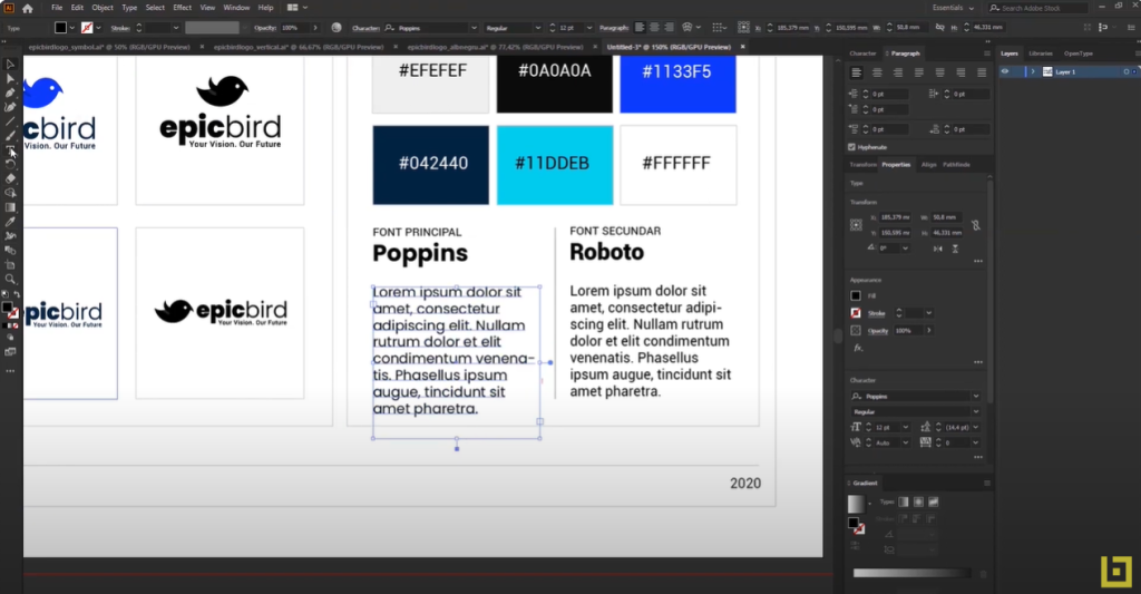
A brandbook is a comprehensive document that contains the brand’s guidelines, including colors, typography, logos, and imagery. It assists designers and web developers in creating a unified online experience, ensuring that the brand is represented consistently across all platforms.
The Importance of Brand Consistency:
Brand consistency helps build trust and recognition, offering customers a seamless experience regardless of the platform they interact with. This consistency is essential for achieving success in the online business environment, as it fosters a sense of reliability and familiarity with the brand.
Elements of a Brandbook:
An effective brandbook includes elements such as:
- Color Palette: Defines the primary and secondary colors representing the brand.
- Typography: Specifies the fonts and typographic styles used in brand communication.
- Imagery Style: Outlines the visual style and characteristics of images associated with the brand.
- Logo Usage: Provides guidelines on how the logo should be displayed and used.
- Messaging and Tone: Describes the brand’s voice, tone, and communication style.
Application in Web Design:
In web design, the brandbook serves as a roadmap. Designers and developers can use it as a guide in creating the website, thereby maintaining consistency with the brand’s overall identity. It ensures that every element on the website aligns with the brand’s values and visual language.
Benefits and Challenges:
The benefits of having a brandbook include increased customer loyalty and brand recognition. However, challenges may arise in maintaining consistency across various platforms and communication channels, especially as the brand evolves and adapts to market changes.
Conclusion:
A solid brandbook is essential for any business aiming to grow and stay competitive in the digital world. It provides a framework for consistency and innovation in web design, contributing to the development of a strong and recognizable brand. By adhering to the guidelines outlined in the brandbook, businesses can create a cohesive brand image that resonates with their target audience and stands out in the competitive market.
Crafting Impactful Business Cards
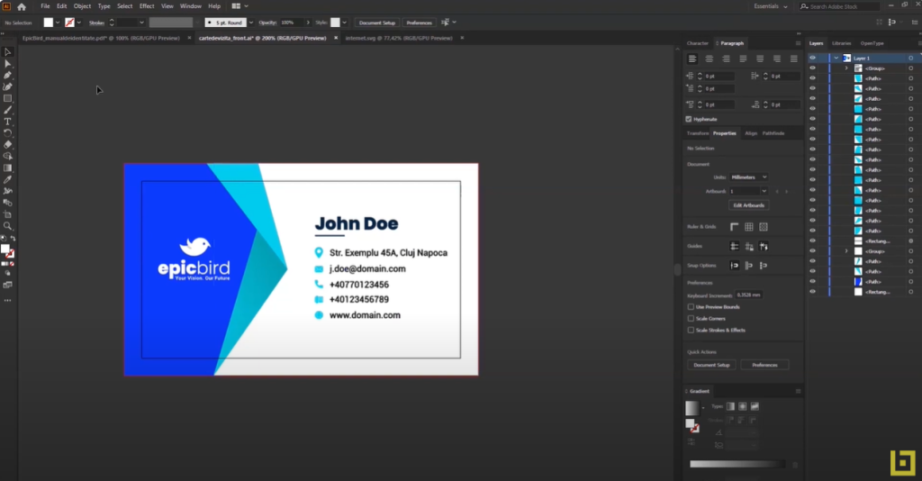
Creating an impactful business card is a crucial step for professionals and businesses alike. A well-designed business card can leave a lasting impression and set a professional tone for future interactions.
The Importance of Business Cards:
A business card is not just a tool for sharing contact information; it’s an opportunity to reflect your brand and make a strong first impression. It serves as a tangible representation of your professional identity and can help in establishing credibility.
Design Elements:
The essential aspects of design include choosing the right colors, appropriate typography, and a clear and concise layout of information. These elements should work together harmoniously to convey the brand’s image effectively.
Information to Include:
A business card should feature essential information such as:
- Name
- Job Title
- Phone Number
- Email Address
- Website
- Company Logo
Quality of Materials:
The quality of the paper and printing can add value to the business card, reflecting professionalism and attention to detail. Opting for high-quality materials can enhance the tactile experience and leave a positive impression.
Consistency with Branding:
Ensuring that the business card design aligns with the brand’s visual identity enhances recognition and creates a unified impression. Consistency in branding elements like color schemes, logos, and typography fosters trust and reliability.
Innovation and Creativity:
Experimenting with shapes, textures, and creative elements can make a business card stand out. However, this should be approached with balance to avoid compromising clarity and professionalism. Unique design features should complement, not overshadow, the essential information.
Digital Versions:
In the digital age, considering a digital version of the business card can extend its reach and offer a convenient way of sharing information. Digital business cards can be easily shared via email or social media, providing an eco-friendly alternative.
Conclusion:
A successful business card combines efficient design with judicious material choices, reflecting the brand and offering an effective method of connection. Whether you are a freelancer or a business owner, a well-crafted business card can be a valuable asset in building professional relationships and expanding your network.
Designing Successful Letterheads
A letterhead is a vital tool in business, reflecting professionalism and consistency. From official letters to invoices, utilizing a letterhead can bring uniformity and credibility to a company’s communication.
What is a Letterhead?
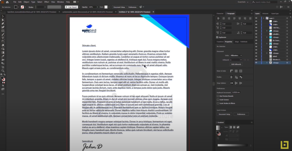
A letterhead includes information such as the company’s logo, address, phone number, and other relevant details, all presented in an aesthetically pleasing and professional manner. It serves as the heading at the top of a sheet of letter paper.
Designing the Letterhead:
Design elements are crucial and should reflect the brand’s identity. This includes the right choice of colors, typography, and arrangement of information. The design should be clean, uncluttered, and convey the brand’s message effectively.
Consistency with Brand Identity:
The design of the letterhead must harmonize with other brand elements, such as business cards and the website, to ensure enhanced recognition and trust. A consistent visual identity across all platforms reinforces the brand’s presence and credibility.
Information to Include:
Besides the logo, a letterhead should contain essential information such as:
- Company Address
- Phone Number
- Email Address
- Website
- Slogan (if applicable)
Quality of Printing and Paper:
Choosing high-quality printing and paper is crucial to reflect professionalism and create a positive impression. The texture and weight of the paper can add to the overall experience and convey a sense of quality.
Legal Aspects:
In some jurisdictions, there are specific legal requirements regarding the information that must be included on a letterhead, so it’s wise to be informed about these regulations to ensure compliance.
Leveraging Technology:
There are numerous tools and software available that can facilitate the letterhead design process, allowing for customization and consistency with other branding materials. Utilizing technology can help in creating a versatile and adaptable design.
Conclusion:
Creating a successful letterhead is not just about incorporating the company’s details; it’s about conveying the brand’s identity and values in a visually appealing manner. A well-designed letterhead can enhance the company’s professional image and contribute to building a strong and trustworthy brand.
Crafting an Effective Brochure
Brochures are powerful and efficient marketing tools used to convey concise information about products, services, or events. Creating an attractive brochure requires attention to design, content, and printing.
Purpose and Target Audience:
Identifying the purpose and target audience is the first step in creating a successful brochure. This information will guide the selection of design, colors, and messaging, ensuring the content is tailored to the intended readers.
Design and Format:
Choosing the correct format (e.g., tri-fold) and an appealing design that reflects the brand is crucial. Visual elements should be harmonious and attention-grabbing, with a layout that guides the reader through the content seamlessly.
Content:
The content should be concise, to the point, and easy to read. Utilizing captivating headlines, high-quality images, and informative text can enhance the impact and convey the message effectively.
Colors and Typography:
The colors and typography should harmonize with the brand identity and facilitate readability. Consistency in font styles and color schemes contributes to a cohesive and professional appearance.
Call to Action:
An effective brochure includes a clear call to action, guiding the reader towards the desired next step, such as visiting a website or attending an event. This element is essential for driving engagement and conversions.
Printing Quality and Paper:
Selecting quality paper and professional printing ensures a premium presentation, reflecting the brand’s professionalism. The tactile experience of holding a well-crafted brochure can leave a lasting impression.
Distribution and Measuring Success:
A well-thought-out distribution strategy is essential to reach the target audience. Measuring the success of the campaign can be achieved through methods such as tracking promotional codes or analyzing website traffic.
Conclusion:
Creating a successful brochure is a multifaceted process that involves attention to detail, brand consistency, and understanding the target audience. Careful planning and execution can result in a marketing tool that effectively communicates the brand’s message and drives engagement.

Showcasing Brand Presentation with Artboard Studio
In the digital age, brand product creation has evolved beyond traditional design, utilizing 3D technology to provide a more realistic and innovative representation. 3D programs enable the development of promotional objects such as calendars, mugs, pens, business cards, and catalogs with enhanced precision and creativity.
The Importance of 3D Branding:
3D branding brings a new dimension to product promotion, offering the ability to visualize objects from multiple angles and with realistic details. This approach elevates the customer’s experience and interaction with the brand.
Object Modeling:
Each object (calendars, mugs, pens, etc.) requires a unique approach to modeling. Employing the correct 3D modeling techniques ensures accuracy and aesthetic appeal, resulting in products that are both functional and visually striking.
Applying Brand Elements:
Logos, colors, and other visual identity elements can be applied to 3D models to create brand consistency. This integration enhances brand recognition and reinforces the brand’s message across various platforms.
Rendering and Visualization:
Rendering provides a final image of the product, which can be used in marketing or in the production process. High-quality renders showcase the product in its best light, offering a glimpse into the real-world application of the item.
Prototyping and Production:
For physical objects, 3D modeling can be used for rapid prototyping and production, facilitating the manufacturing process. This capability accelerates the time from concept to market, allowing for quicker adjustments and refinements.
Integration into Promotional Materials:
3D images can be integrated into catalogs, websites, and other promotional materials for a dynamic and attractive presentation. This integration enhances the overall marketing strategy, providing a more immersive experience for potential customers.
Conclusion:
Utilizing 3D programs in creating brand products offers a myriad of opportunities for innovation and precision. The ability to visualize, prototype, and integrate brand elements in a three-dimensional space revolutionizes the way brands are presented and experienced, ultimately contributing to a stronger and more memorable brand identity.

Crafting Branding for Social Media
Branding on social media is crucial for building a cohesive and recognizable brand image in the online landscape. In a world where social media plays a pivotal role in communication and marketing, effective branding can enhance visibility and brand loyalty.
Understanding the Audience:
Identifying and understanding the target audience are essential for developing a branding strategy that resonates with users. This insight allows brands to tailor their content and messaging to meet the needs and interests of their audience.
Consistency with Brand Identity:
All elements on social media platforms, from images to the tone of messages, should reflect the brand’s identity and values. Consistency across platforms reinforces brand recognition and builds trust among followers.
Creating Custom Graphic Elements:
Profile images, banners, and posts should be uniform and align with the brand’s style guide. These visual elements contribute to a cohesive brand presence and enhance the user experience.
Crafting Relevant Content:
Content should be engaging and relevant to the audience while reflecting the brand’s mission and values. Quality content fosters community engagement and positions the brand as a thought leader in its industry.
Interaction and Engagement:
An essential part of social media branding is how the brand interacts with followers, promoting an engaged community. Responsive and authentic communication fosters a sense of connection and loyalty.
Monitoring and Analyzing Performance:
Using analytics tools to track success and adjust the strategy is vital for maintaining relevance and effectiveness. Regular analysis informs data-driven decisions and optimizes the brand’s social media presence.
Integrating Cross-Channel Campaigns:
Synchronizing branding campaigns across different social platforms and media channels ensures a unified and strong presence. Integrated campaigns amplify the brand’s message and reach a broader audience.
Legal and Ethical Compliance:
Adhering to laws and ethics on social platforms is crucial for maintaining a positive reputation. Brands must navigate the digital landscape responsibly, respecting user privacy and community guidelines.
Conclusion:
Branding for social media is a complex process that requires a well-thought-out strategy and consistent execution. In a constantly evolving digital world, adaptability and authenticity are key to building a strong, recognizable brand that resonates with the audience and stands the test of time.
